
Research
UX/UI Design
Data Visualization
IoT Platform
Real-Time Analytics

Designing a predictive analytics platform for asset health
Designing a predictive analytics dashboard for monitoring asset health and detecting operational risks in real time.


About Accupredict
Accupredict is an industrial analytics solution that leverages IoT data to monitor asset health, predict failures, and detect risks in real time. The platform helps organizations move from reactive maintenance to proactive, data-driven decision-making.


About the project
The project focused on designing a real-time analytics platform that visualizes data from IoT-enabled assets. The objective was to present complex sensor data, predictions, and risk indicators in a way that is easy to interpret and act upon.
Key goals included:
• Real-time visibility into asset performance
• Clear representation of risks and anomalies
• Actionable insights for maintenance and operations teams
• Scalable dashboard layouts for multiple asset types
Visual language & colours
The color system was designed to support quick interpretation of status and risk. High-contrast colors highlight alerts, thresholds, and anomalies, while neutral tones reduce visual noise in data-dense screens.
Color was used functionally—to communicate health, warnings, and critical conditions at a glance.


Design concepts
Early concepts explored different dashboard structures to balance information density and clarity. Multiple layouts were tested to ensure key metrics remain visible while allowing deeper analysis through secondary views and drill-downs.


Final experience
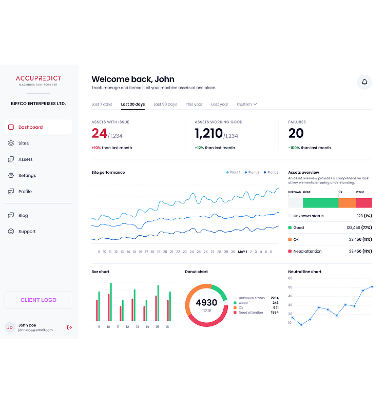
The final platform delivers a clear, structured view of asset performance and predictive insights. Users can monitor trends, identify potential risks early, and take informed action—all from a single, cohesive interface.


Predictive insights & data visualization
Charts, graphs, and KPIs were designed to clearly communicate trends, forecasts, and risk indicators. Interactive elements allow users to explore historical data, compare assets, and understand patterns without overwhelming the interface.
Scalable dashboard framework
The dashboard system was designed to support multiple asset types, data streams, and future enhancements. This ensures the platform can evolve as new devices, metrics, and predictive models are introduced.


Reflections
Designing a predictive IoT analytics platform highlighted the importance of clarity and trust in data-driven products. By focusing on usability and visual hierarchy, we transformed complex real-time data into insights that support proactive and confident decision-making.
Predictive insights & data visualization
Charts, graphs, and KPIs were designed to clearly communicate trends, forecasts, and risk indicators. Interactive elements allow users to explore historical data, compare assets, and understand patterns without overwhelming the interface.
Scalable dashboard framework
The dashboard system was designed to support multiple asset types, data streams, and future enhancements. This ensures the platform can evolve as new devices, metrics, and predictive models are introduced.
