
Research
UX/UI Design
Analytics Platform
Data Visualization
SaaS

Designing a speech analytics portal for contact centers
Designing an analytics platform that transforms call data into actionable insights for contact center teams.


About Yactraq
Yactraq provides advanced speech analytics solutions that help organizations analyze conversations at scale. By extracting insights from call data, the platform enables contact centers to monitor performance, improve customer interactions, and make data-driven decisions.


About the project
The project involved designing Yactraq’s primary analytics portal, where contact center teams can monitor call performance, identify trends, and evaluate agent effectiveness.
The challenge was to transform large volumes of conversation data into a clear and intuitive analytics experience.
Key goals included:
• Simplifying complex analytics for everyday users
• Highlighting key performance metrics and insights
• Designing dashboards that support operational decision-making
• Ensuring scalability as datasets grow
Visual language & colours
The color palette was designed to balance clarity and visual distinction across multiple data visualizations. Strong accent colors highlight important metrics and alerts, while neutral tones reduce visual noise in dense dashboard environments.


Design concepts
Early concepts explored multiple dashboard structures to determine how best to present speech analytics insights. The focus was on balancing data density, readability, and interaction flexibility so users can quickly move between high-level insights and deeper analysis.


Final experience
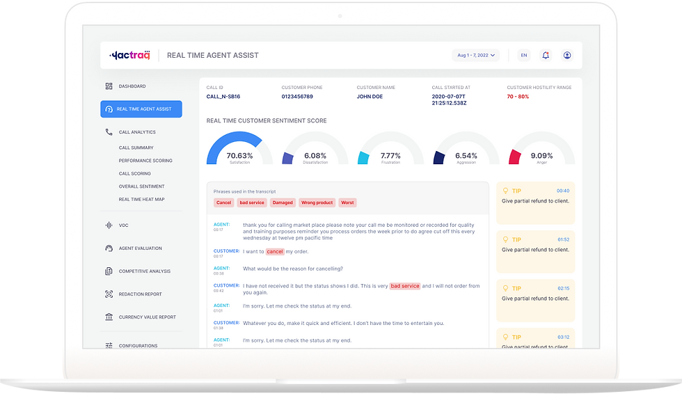
The final portal provides a clear and structured analytics environment where users can monitor call performance, analyze conversation trends, and identify improvement opportunities across teams.
Information is presented through a combination of charts, summaries, and detailed views that support both quick insights and deeper investigation.


Data visualization
Dashboards were designed to help teams quickly interpret key metrics such as call trends, sentiment analysis, agent performance, and conversation patterns.
Interactive visualizations allow users to explore data dynamically and uncover insights that support operational improvements.
Scalable analytics framework
The portal was designed to support growing datasets and evolving analytics capabilities. Flexible layouts and reusable components ensure the platform can expand as new metrics, models, and features are introduced.



Reflections
Designing an analytics portal for speech data reinforced the importance of clarity and usability in data-heavy environments. By focusing on structured dashboards and meaningful visualizations, we created an experience that helps teams turn complex data into actionable insights.
Data visualization
Dashboards were designed to help teams quickly interpret key metrics such as call trends, sentiment analysis, agent performance, and conversation patterns.
Interactive visualizations allow users to explore data dynamically and uncover insights that support operational improvements.
Scalable analytics framework
The portal was designed to support growing datasets and evolving analytics capabilities. Flexible layouts and reusable components ensure the platform can expand as new metrics, models, and features are introduced.
