UX Design Trends to Watch in 2027
Every October, design teams begin the work of figuring out what the next year will require of them. Budgets are drafted. Roadmaps are shaped. Skill gaps are identified. And the questions that have been quietly accumulating through the year about AI, about spatial computing, about accessibility, about the aesthetic direction of digital products need answers.
This post is our assessment of the eight UX and UI design trends that will most significantly shape product design in 2027. These are not aesthetic predictions. They are shifts in how products are designed, what users expect, what regulators require, and what technology makes possible. Some of them are already underway and will accelerate. Others are reaching an inflection point where early movers will gain meaningful advantages.
At Afrodity Designs, these are the trends we are building into our practice and recommending to clients who want their products to feel ahead of the curve rather than catching up to it.

Trend 1: AI-Native Interface Design
The first wave of AI in product design was additive: a chatbot here, a recommendation engine there, a generative search feature bolted onto an existing structure. The second wave which is already arriving and will define 2027 is architectural. AI-native interface design means building the entire product structure around AI capabilities, not retrofitting them into existing paradigms.
What does this look like in practice? It means interfaces where the primary interaction layer is conversational or intent-based rather than menu-driven. It means navigation structures that surface contextually relevant functions rather than presenting everything all the time. It means products that learn individual user patterns and progressively simplify their own interfaces based on what each user actually does. The design challenge is significant: when the interface is dynamic and adaptive, traditional notions of information architecture, consistent navigation, and predictable UI patterns all require rethinking.
The most important design principle for AI-native interfaces is trust transparency: users need to understand what the AI is doing, why it is making the choices it is making, and how to override it when it gets things wrong. Explainability is not a feature — it is a foundational UX requirement.

Trend 2: Spatial Computing Maturation
Spatial computing is moving from novelty to practice. Apple Vision Pro is now in its second product generation. Competitors from Meta, Samsung, and Google are shipping spatial devices at progressively lower price points. And the visionOS developer ecosystem has matured to the point where design patterns are beginning to standardise —the way iOS patterns standardised between 2008 and 2011.
For product designers, 2027 is the year to move from awareness to competency. The teams that understand gaze-based interaction, the ergonomics of spatial UI, the three-tier structure of Windows, Volumes, and Spaces, and the comfort requirements of extended wear will have a meaningful head start when spatial computing reaches the adoption curve that makes it a standard product requirement. The visionOS Human Interface Guidelines remain the most comprehensive single document for building that competency.

Trend 3: The Post-Flat Aesthetic
Flat design has been the dominant visual language of digital products since approximately 2013. It was a necessary correction to the skeuomorphic excesses of the early smartphone era, and it produced interfaces that were cleaner, faster to render, and more legible. But after more than a decade, flat design has become the default which means it has stopped communicating anything distinctive.
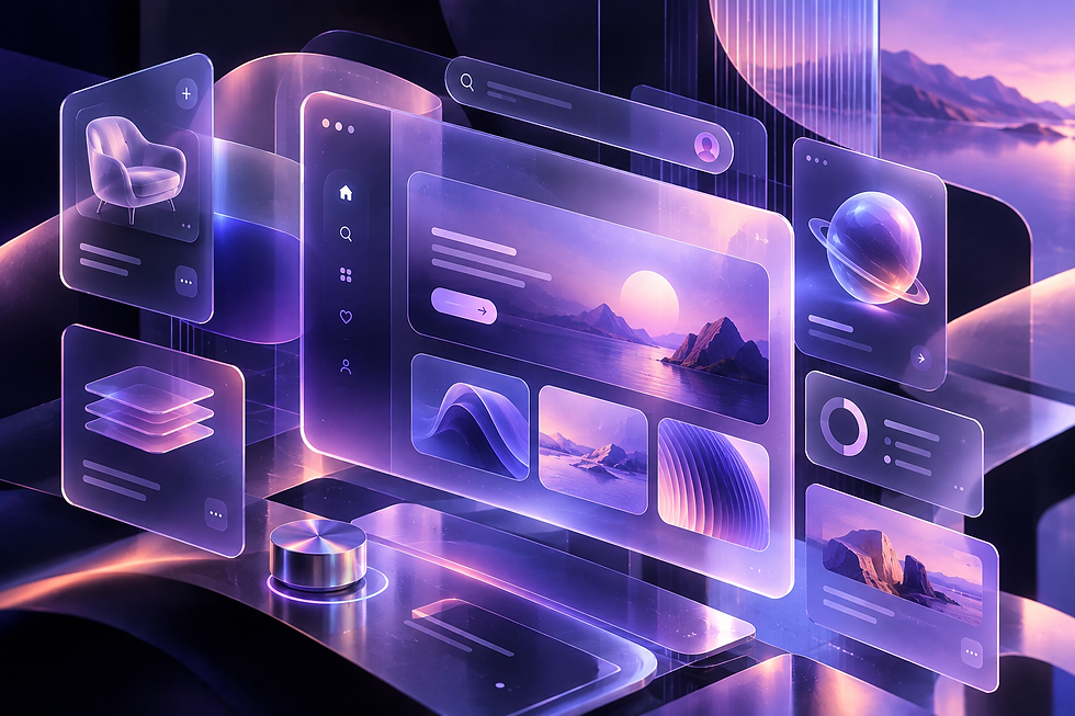
The post-flat aesthetic that is emerging in premium digital products in 2026 and 2027 is not a return to skeuomorphism. It is a more nuanced reintroduction of physicality: soft gradients, subtle material textures, layered glass effects (the glassmorphism aesthetic that has matured from a trend into a design system primitive), bento grid layouts, and intentional use of depth and shadow that goes beyond the flat drop shadow. Apple’s own UI language particularly in visionOS and the latest iterations of iOS is the most visible signal of where the premium digital aesthetic is heading.
For product designers, this trend requires renewed investment in understanding light, material, and depth skills that the flat design era made less critical but that the post-flat aesthetic demands.
Trend 4: Adaptive and Variable Typography
Typography is becoming responsive in ways that go beyond breakpoint-based size changes. Variable fonts which encode an entire range of weights, widths, and optical sizes in a single file enable type that responds fluidly to screen size, viewport width, and even reading context. Fluid type scales, which use CSS clamp() to interpolate between minimum and maximum sizes across a continuous range of viewport widths, are replacing the traditional breakpoint-based type scale as the standard approach for responsive typographic design.
In 2027, the most sophisticated products will go further: type that responds to ambient light levels (heavier weights in low contrast conditions), user accessibility preferences (not just larger text but adjusted spacing, letter-spacing, and line height), and even emotional context (marketing pages versus error states using different positions on the same variable font’s weight axis). The infrastructure for this CSS variables, variable fonts, prefers-reduced-motion and prefers-color-scheme media queries is already in every modern browser.

Trend 5: Voice-First and Multimodal UX
Voice interaction has been a feature in digital products for a decade. In 2027, it is becoming a primary interaction layer for a growing category of contexts: spatial computing, wearables, in-vehicle interfaces, ambient computing devices, and increasingly mobile products in hands-free contexts. The shift is from 'voice as an alternative' to 'voice as a first-class interaction paradigm.'
Multimodal UX interfaces that understand and respond to combinations of voice, touch, gesture, gaze, and environmental context simultaneously is the design challenge that most product teams are least prepared for. The design principles are different: you cannot rely on visual affordances to communicate what is possible through voice. Discoverability requires different strategies. Error states and recovery flows are completely different when the input modality is speech rather than touch. Designers who develop fluency in conversational UX and voice interface design in 2027 will be ahead of a significant competency curve.

Trend 6: Ethical Design and Regulatory Compliance as Competitive Advantage
The regulatory environment around digital design is tightening globally and rapidly. The EU's Digital Services Act, the EU AI Act, the FTC's increased enforcement against dark patterns, WCAG 2.2 becoming the legal standard in most jurisdictions, and the European Accessibility Act's June 2025 application date these are not distant compliance concerns. They are active requirements that product teams are already navigating.
The opportunity in 2027 is for design teams to lead their organisations in turning compliance into a competitive differentiator. A product that is genuinely accessible, genuinely privacy-respecting, and genuinely free of manipulative patterns builds a level of user trust that is increasingly rare and therefore increasingly valuable. The Hall of Shame at deceptive.design catalogues the patterns to avoid. The more interesting design exercise is identifying the honest equivalents that build trust while achieving the same business outcomes.

Trend 7: Inclusive Design as the New Baseline
Accessibility has spent two decades as a compliance consideration something checked at the end of the process to ensure minimum legal conformance. In 2027, this is changing. The combination of regulatory enforcement, growing legal precedent, and a design culture that increasingly recognises accessibility as a quality indicator rather than a constraint is moving inclusive design from the compliance checklist to the design brief.
The most progressive design teams are treating the Microsoft Inclusive Design methodology which frames accessibility solutions as innovations that serve the widest possible range of users, not just those with permanent disabilities as a creative framework rather than a constraint. Captions that serve non-native speakers as much as deaf users. Touch targets sized for motor impairment that are simply more comfortable for everyone. High contrast modes that are usable in full sunlight as well as by users with visual impairments. The business case for inclusive design has never been stronger.

Trend 8: Hyperpersonalisation Through AI
Personalisation in digital products has historically meant showing different content to different user segments. Hyperpersonalisation means adapting the interface itself, its structure, its defaults, its language, its visual density to the individual user's behaviour patterns, preferences, and context. AI makes this possible at a scale and speed that rule-based personalisation never could.
The design challenges of hyperpersonalisation are significant. Users need to understand what is being personalised and why. They need meaningful control over personalisation settings. And the experience of a product that looks different for different users creates documentation and support challenges that most product teams have not fully worked through. The products that get this right in 2027 will create experiences that feel genuinely attentive rather than merely algorithmically optimised.

How to Apply These Trends to Your Product
Trend awareness without application is just reading. Here is how to move from awareness to action on each of these trends in 2027.
AI-native interfaces: audit your product for features that are AI-powered but still presented through traditional menu-based navigation; identify one flow where an intent-based interface would reduce steps and test it
Spatial computing: read the visionOS HIG and build one prototype in Reality Composer Pro; you do not need to ship to visionOS to begin developing spatial design instincts
Post-flat aesthetic: run a visual audit of your current product against the emerging glassmorphism and layered-depth aesthetic; identify where your visual design feels dated and what a more material treatment would look like
Variable typography: replace your current static type scale with a variable font and fluid type scale; this is a relatively contained engineering change with immediate visual quality benefits
Ethical design: conduct a dark pattern audit of your own product using the deceptive.design taxonomy; identify any patterns that manipulate rather than serve users and create a roadmap to remove them
Inclusive design: schedule a screen reader testing session for your core flows this quarter; make it a recurring item on your definition of done for new features going forward
The most dangerous response to a trend is to wait until it is mainstream before paying attention. By then, it is table stakes, not a differentiator. The value is in understanding what is coming early enough to shape how your product responds to it.

Final Thoughts: Trend Awareness Is Not Trend Chasing
The goal of following design trends is not to implement every new thing as quickly as possible. It is to understand the forces shaping the environment your product exists in the user expectations, technological capabilities, regulatory requirements, and aesthetic sensibilities that will determine what feels current and what feels dated in 2027 and beyond.
The best design teams take what is useful from each trend, adapt it to their product’s context and users, and leave the rest. Not every product needs a spatial computing strategy in 2027. But every product needs a clear answer to how AI will shape its interface, how it will meet evolving accessibility requirements, and whether its visual language is doing justice to what it is trying to communicate.
At Afrodity Designs, we help product teams answer those questions through design system work, UX audits, and end-to-end product design engagements that keep one eye on where design is going and the other on what your specific users need right now. If you want to talk about how any of these trends apply to your product, we would love to have that conversation.


