Building a Design System: A Comprehensive Guide
- May 22
- 4 min read
Updated: Jun 1
What Is a Design System, Really?
At its core, a design system is a collection of reusable components, guided by clear standards. These components can be assembled together to build any number of applications. Beyond the technical definition, a great design system is a product in its own right — one that serves other products. It has users (your designers and developers), it needs maintenance, and it must evolve with the organization it serves.
The most celebrated design systems in the industry — Google's Material Design 3, IBM's Carbon Design System, and Atlassian's Design System — are all built on the same foundational principles: consistency, scalability, and accessibility. Studying these systems is an education in itself.

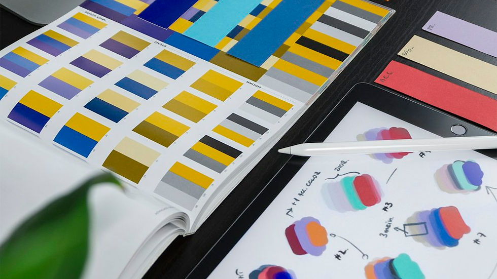
Step 1: Start with Design Tokens
Design tokens are the atomic units of a design system. They are named values that store design decisions — colors, typography, spacing, shadows, border radii — in a format that can be consumed by both design tools and code. Rather than hardcoding a hex value like #1A1A2E across dozens of components, you define a token: `color.brand.primary = #1A1A2E`.
Why does this matter? Because when your brand refreshes its palette — and it will — you change one token value, and every component updates automatically. Tokens are what make a design system truly scalable across platforms, themes, and product lines.
Essential Token Categories
Colour tokens — brand, semantic (success, warning, error), and neutral scales
Typography tokens — font family, size scale, line height, letter spacing, weight
Spacing tokens — a consistent scale (e.g., 4px base unit) for margins and padding
Elevation tokens — shadow styles for cards, modals, and floating elements
Motion tokens — duration and easing curves for animations and transitions

Step 2: Build Your Component Library
With your tokens in place, you're ready to build components. Start with the atoms — the smallest, most fundamental UI elements: buttons, inputs, checkboxes, badges, icons. From atoms, compose molecules: a search bar (input + button + icon), a form field (label + input + helper text). Then organisms: a navigation bar, a data table, a product card.
This hierarchical approach comes from Brad Frost's Atomic Design methodology, which remains one of the most influential frameworks for structuring component libraries. If you haven't read it, it's essential reading for any UX/UI professional.
Rules for a Maintainable Component Library
Each component must have a single, well-defined purpose.
Variants should be built with props, not duplicated components.
Every component must meet WCAG 2.1 AA accessibility standards.
Components must be documented with usage guidelines, do's and don'ts.
Design files (Figma) and code (React/Vue/Web Components) must stay in sync.
Step 3: Write Documentation That Gets Used
A design system without documentation is like a city without road signs. Components without guidance get misused, and a misused component is worse than no component at all. Your documentation needs to answer three questions for every component: When should I use this? How should I use it? What should I avoid?
Keep documentation close to the components themselves. Tools like Storybook allow you to write interactive documentation alongside your code components. For design-side documentation, Figma's built-in component descriptions and annotations work well for teams working primarily in the design tool. For larger systems, a dedicated documentation site (like those powered by Storybook or ZeroHeight) becomes the single source of truth for the whole organization.
Step 4: Governance — How the System Evolves
The most overlooked aspect of design systems is governance: the process by which the system grows, changes, and stays healthy over time. Without clear ownership and contribution models, design systems become stale, inconsistent, or abandoned entirely.
There are three common governance models. The centralized model has a dedicated design system team responsible for all contributions. The federated model distributes ownership across product teams, with a central team setting standards. The hybrid model combines both. Most mature organizations find the hybrid model most effective — teams can contribute components, but they must pass through a review process before becoming part of the official system.
A design system is never finished. It grows with your product, your team, and your users. Treat it as a living document, not a static deliverable.
Step 5: Driving Adoption Across Your Organisation
Building a design system is the easy part. Getting people to use it is where most systems fail. Adoption requires evangelism, tooling, and trust. Designers need to feel the system makes their work faster and better, not more constrained. Engineers need confidence that the components are production-ready and accessible.
Run workshops. Create onboarding guides. Celebrate teams that use the system well. Treat every bug report or component request as a signal to improve. The teams that succeed with design systems are the ones who invest in community-building as much as component-building. The Design Systems Slack community and the annual Design Systems Surf conference are excellent resources for connecting with practitioners navigating the same challenges.
Is It Time to Build Yours?
Not every team needs a full-scale design system immediately. If you have fewer than three designers and one product, a lightweight style guide may serve you better. But if your team is growing, your product is expanding, and inconsistency is starting to slow you down — the time to invest is now, before the technical debt compounds.
At Afrodity Designs, we specialize in building design systems that are practical, beautiful, and built to last. From token architecture to Figma component libraries to full developer handoff packages — we can help you build the foundation your product deserves. Let's talk.


